Exploring the top menu features
Top menu
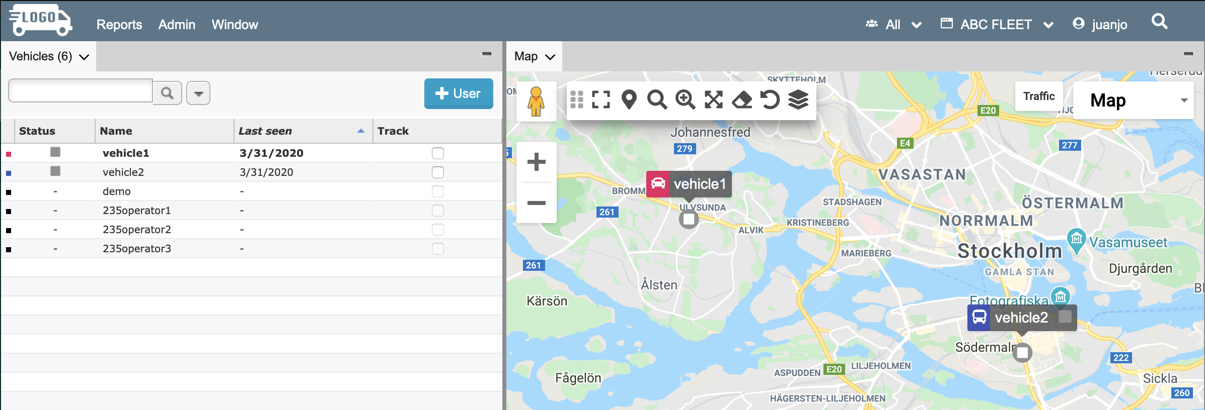
The top menu bar redesign provides better branding, workflow improvements, and user interface updates. It is easier to find the settings you are looking for and the clean design removes distractions so you can focus on what's important.

In-app search
The power of search is now available in applications! You can search for anything within an application with a click on the search button (top right of the menu bar) or by just typing a period ’ . ’ We’ve fondly called it Mega Search internally, and it lives up to its nickname.

Simply type a few letters, and the system starts displaying matches. If you know exactly what you’re looking for, you can narrow down the search to users, geofences, or POIs. Check out some search tips and shortcuts.
Searchable dropdown lists
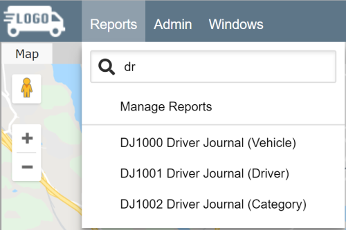
Search is now available in the Reports menu. To quickly find a report, simply start typing in the search bar under the Report menu. The list will update as you enter characters.

The menu dropdown items in the top menu bar also display in alphabetical order. This makes it easy to find the items you want to access.
Efficient workspace customization with autosaving settings
Autosaving settings saves users time... and headaches! No more worries about saving your settings. Marker related workspace settings like Marker Attributes and Vehicle Marker Settings will automatically be saved to the workspace after pressing "Save" in the settings window.
Design and UI changes
The user interface optimizes the user experience. The top menu bar updates make menu items clear, easy to understand, and easy to select. You will notice tweaks and improvements across menus and windows.
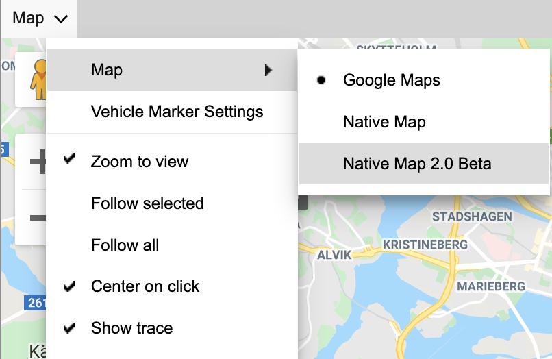
Accessing the panel menus
The panel menus are now embedded in the panel tabs, so they are easy to find and click.

Was this article helpful?
That’s Great!
Thank you for your feedback
Sorry! We couldn't be helpful
Thank you for your feedback
Feedback sent
We appreciate your effort and will try to fix the article